
How to Build a Portfolio Website with AI (Free Step-by-Step Guide)
Build a designer-grade portfolio website with AI in under 20 minutes. Step-by-step Lokuma walkthrough — drop in your work, prompt, refine, and publish free. Video included.
Most AI-built portfolios give themselves away in about a second. The headline sits dead-center over a slightly-too-stock hero, the type is whatever the model reached for by default, and the work lands in one long undifferentiated scroll. An art director who's been through a hundred submissions doesn't read any of it. They register made by a machine, in a hurry, and move on.
I won't pretend I shoot for a living. But I've looked at enough of these to know that for a photographer or a designer, the website isn't really a marketing asset, it's a sample of the work itself. If the site looks generated, the work behind it starts to read as generated too, fairly or not. So the bar here isn't "can AI put up a website" (it obviously can). It's whether the thing it puts up is good enough that you'd attach your name to it and send the link to a magazine.
This walkthrough uses a portrait photographer's portfolio as the running example, but it's less a list of buttons to press than an explanation of why the steps are shaped the way they are. If you just want to watch the clicks, the video does that. If you want to understand what's happening underneath well enough to drive it deliberately, read on. Designers, illustrators, architects: same mechanics, swap the subject.
Watch the full walkthrough
The video builds one end to end, in real time, with narration. Treat it as the demo. The rest of this piece is the part the video can't slow down for: the reasoning behind each move, so you make better decisions when it's your work on the screen.
https://www.youtube.com/watch?v=FsnzIn_C5N8
How it actually works (the part worth understanding first)
Two design decisions underneath Lokuma explain almost everything about why the steps feel the way they do. Worth getting them straight before you build, because they change how you use the tool.
The first is what "AI design" means here. A generic builder generates a layout by free-associating against everything it has ever seen, which is exactly why the output trends toward the average of the whole internet, and the average of the whole internet is mediocre. Lokuma works the other way around: it retrieves from a curated library of design archetypes (palettes, type pairings, layout conventions, the do's and don'ts that go with each look) and adapts one that already fits the kind of work you're showing. Grounding the generation in real, deliberately chosen reference is the difference between a site that looks designed and one that looks assembled. If you want the longer argument for why this matters, we wrote it up in what a design agent actually is and the missing layer in the agent stack.
The second is the shape of the agent. Older AI builders run one big generation and hand you a draft to live with; change one thing and you often re-roll the whole site and lose everything you liked. Lokuma 2.0 behaves like an agent instead: it drafts a plan, shows it to you before running, and then patches only the part you asked about rather than regenerating the page. You watch it happen in a live preview.
That second point sounds like an implementation detail. It isn't, not for a portfolio. A portfolio gets edited to death. You reorder series, swap the hero three times, second-guess the palette, come back a week later and change your mind again. A tool that rebuilds the entire site on every tweak makes that loop punishing, so people stop refining and settle. Holding the rest of the page steady while you change one block is the unglamorous thing that actually lets the work get good. Keep both ideas in mind; the steps below are downstream of them.
Step 1: Pick your industry
In the top nav, open Industries and choose Art and Design. That's where photographers and other visual pros sit in Lokuma's taxonomy.

This isn't a cosmetic filter. Choosing the category narrows the retrieval to the slice of the design library built for visual work: grid-forward, editorial, restrained, image-led, the conventions a gallery or an agency site actually follows. You're telling the system which neighborhood of design to draw from before it draws anything. From here you can start from a specific template and customize it (the Silvergrain photographer portfolio template is a good base, or skim the full library), or skip templates and let the agent build from your prompt. The walkthrough takes the second path, because that's where you see what the system does on its own.
If your work is closer to a personal brand than a studio, a creator, a writer, a content brand, the builder for creators and personal content draws from a different part of the library shaped for that.
Step 2: Give it your work before you give it words
This is the step people skip, and it's the one that most determines whether the result looks like yours or like everyone's.
Before you type anything, upload your strongest photographs. Not the whole archive, your best five frames. The agent reads them to pull color, mood, and visual language straight out of your actual photography, then carries that into the palette and image treatment it chooses. This is the highest-leverage input you have, and skipping it is the single most common reason an AI-built portfolio comes out generic: with nothing real to anchor on, the system falls back to safe defaults. Feed it phone snaps and you get a phone-snap site. Feed it your portfolio and it has something true to work from. (Yes, your own photos are exactly what it wants. That's the point.)
Only then describe the site, in plain language:
"Portfolio for Mira Chen, editorial portrait photographer in Brooklyn. Cinematic, muted, mid-century editorial. Audience: magazines, ad agencies, fashion brands. Work organized by series. About page. Contact for bookings."
That's enough, and here's the part that surprises people: making the prompt more elaborate doesn't make the output better. Opening ChatGPT to engineer a "perfect" brief is wasted effort, because the intelligence lives in the agent's library and retrieval, not in how cleverly you phrase the request. What the prompt needs to carry is the information the system can't infer from your images: who the work is for, and how it should be organized. The aesthetic it can read from your photographs; the audience and structure it can't.
Step 3: Answer a few questions, skip the ones you don't care about
When you submit, a short questionnaire slides in from the left. It reads your prompt first and only asks about what you left out, which is why it's genuinely short instead of the usual twenty-field intake. It'll ask for the vibe (for editorial portraiture, something like atmospheric and immersive), the audience, what you want visitors to do, and which hero layout you want, each shown as a visual preview rather than a label. For an editorial photographer the full-bleed option is the obvious one.
Every question also has a Let AI decide button, and it's safe to lean on. Because each design archetype in the library comes with sensible defaults, "let it decide" doesn't mean "roll the dice", it means "use the convention that fits this kind of site." Which is the answer to the question people ask most often before they start: no, you don't need design training or any code to get a good result. The judgment is in the system. You decide things in plain language and through choices shown as pictures; it handles type, spacing, hierarchy, and the rest. (If you do happen to code, there's a code-export path on paid plans, but you're never pushed toward it.) You're a photographer. You shouldn't have to think like a brand strategist to get a site that looks like one made it.
Step 4: Watch it build, then refine
Hit go and the agent builds in front of you. It lays down structure first, hero, work grid, series sections, about, contact, then applies the design system on top: the type pairing, the palette, where images sit. A first pass takes ten to twenty minutes, but speed is the least interesting thing about it. The interesting thing is that the result arrives with opinions.

In the build from the video above, what came out was a full-bleed hero on a single photograph with the name set bottom-left, not the centered stack you'd recognize from a hundred other sites. A real editorial pairing, serif over a clean sans. And the work grouped into series, each with room to breathe and a short curatorial line, instead of dumped into a uniform grid. That grouping, deciding that these frames form a body and deserve a caption, is the kind of judgment you'd normally pay a designer for. It's downstream of the curated library from earlier: the system isn't inventing an editorial layout, it's adapting one that already knows how editorial work is supposed to sit on a page.
Then you refine, and there are two modes, which map onto two different ways of thinking.
Visual Edit is for when you know exactly what you want to touch. Flip it on and the page becomes directly clickable; select any element and a small toolbar appears on the canvas. Replace swaps a photo on the spot. Edit link points any element, a photo, a series cover, your name, anywhere you want, an exhibition page, your Instagram, a press feature, so the site quietly becomes a hub for everywhere else your work lives. Select parent lets you click an image and climb up to the whole section it sits in, so you edit at the right level instead of fighting the layout. Ask AI scopes a prompt to just the thing you selected, so "warm this up a little" changes one photo and leaves the rest alone. And View code is there if you want to see what's underneath.

Discuss is for when you have a feeling rather than a target, and it's the mode that shows the plan-first architecture most clearly. You talk to it, "make the hero feel more clinical," "tighten the work grid", and before it touches anything, it writes back the design direction first: the reasoning about mood, type, and layout it intends to apply, in plain words, and waits for you to approve. You're reading the thinking before any code ships, not reacting to a surprise after. Each edit spends a credit, which sounds like a constraint and is actually a useful one: it nudges you to think for a second instead of firing off ten reflexive tweaks, and it kept me from over-tinkering a site that was already done.
The fast, cosmetic decisions live in the Style panel on the right, none of which re-runs the agent. Palette matters most for a photographer, and the telling detail is that Lokuma only surfaces palettes it considers compatible with your current look, each with a mood label; pick a loud, off-brand one and it warns you the pairing isn't typical for your style. That guard rail exists because the design library encodes relationships between looks, not just a list of swatches, so it can tell you when a choice fights the rest of the site. Fonts work the same way, compatible pairings first. Brand is where your wordmark lives, name-only or with an uploaded logo, plus an optional location or tagline.
All of this is where the targeted-patching decision pays off in practice: swap one image in the work section and the hero doesn't move, the about section doesn't move, only that one block updates. That's the entire reason editing a portfolio here doesn't feel like starting over every time, and why you'll actually keep refining until it's right instead of stopping at the first draft.
Step 5: The dashboard, where the unglamorous decisions live
Preview the site and look left for the project dashboard. Two parts of it matter for a portfolio.
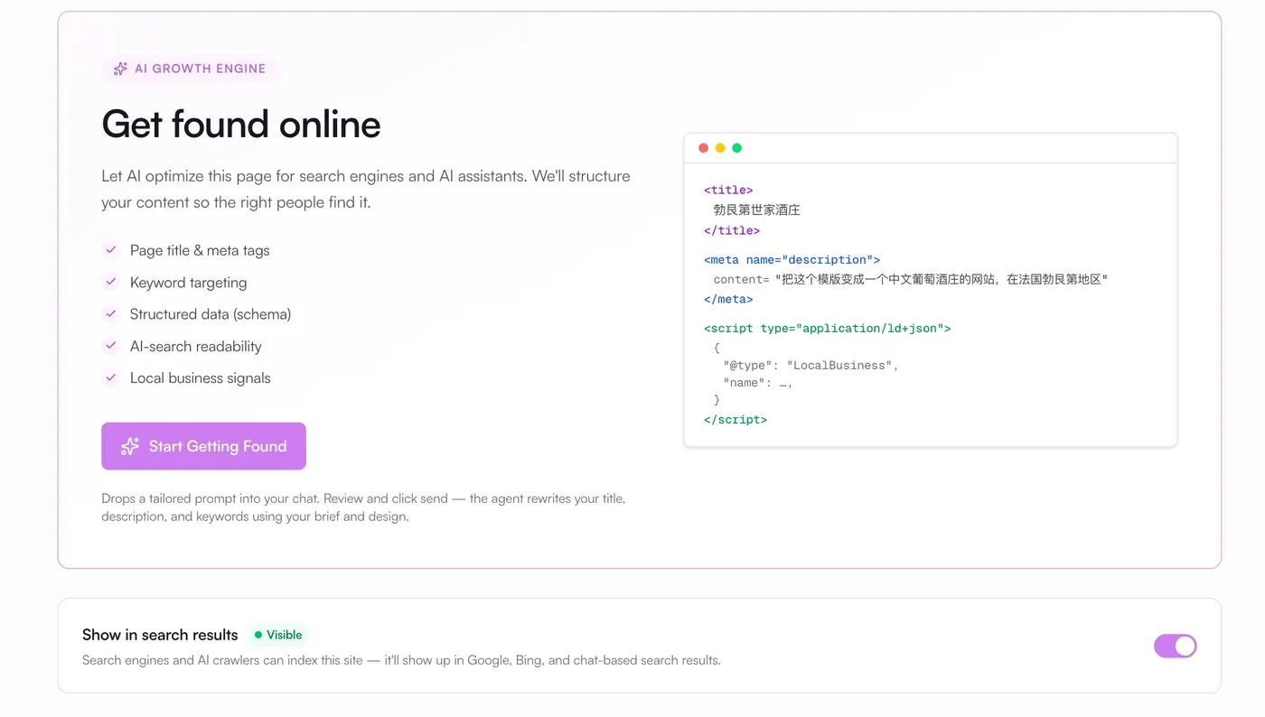
SEO gives you every page title, meta description, and heading in one panel, and it matters more than photographers usually assume. It's structural, not decorative: it's what decides whether you surface when an art director googles your name after meeting you at a shoot. Most portfolios quietly fail this because the photographer never thinks about it; here it's a five-minute pass instead of a plugin rabbit hole. The Dashboard Guide and Key Features docs go deeper if you want them.
Submissions collects every contact-form inquiry inside the project, so you're not wiring up a third-party form service to catch a booking email. There's also an Overview, Settings, and a Leads & Analytics section marked coming soon.
Step 6: Publish free, then put your own domain on it
Hit Publish and the site goes live on a Lokuma subdomain immediately, at no cost.

This is rarer than it should be; plenty of builders make you subscribe before you can show anyone anything. Being able to ship free means you can send the link to one person whose taste you trust and get a real reaction before you spend a dollar, which is the right order to do things in. A subdomain won't carry a working portfolio for long, you'll want your-name-dot-com, and connecting a custom domain happens in the Domains panel on a paid plan (pricing here; the custom domain setup guide covers the DNS side). If you want bookings landing straight from the site, the Calendly guide covers wiring a "book a session" button to your scheduling link.
A note for the developers reading this
If you build sites with AI coding tools rather than in a visual editor, the same design intelligence is available as a standalone product, the Design Agent, exposed as an API your own agents can call. One shell command to install, an API key, and Claude Code, Cursor, or Codex gets design reasoning it didn't have before: layout, type, hierarchy, the specific things that otherwise make AI-generated UIs look AI-generated. It's the same bet as the rest of this piece, that design is becoming a layer you call rather than a step you skip, just pointed at codegen instead of a visual canvas. Metered per call (pricing).
The only review that counts
The honest test for any of this is simple. Build the site with your actual best work, not placeholder shots, publish it, and look at it cold the next morning. Would you send that link to someone whose opinion you're a little afraid of? For visual work that's the whole question, because the site stands in for the work before anyone has seen a single real frame.
The reason this is worth writing about at all is that until recently the answer was reliably no; AI builders were too obviously machine-made for the question to be serious. What changed isn't that the models got bigger. It's that the design judgment got grounded in something curated instead of averaged, and the editing loop got patient enough to let you refine. That's the whole shift, and it's why an AI portfolio can now, sometimes, walk into the room and read the part.
Frequently asked questions
Is it really free to publish? Yes. You can build and publish to a free Lokuma subdomain with no subscription. Connecting your own domain, which any real portfolio eventually needs, is on a paid plan; see pricing.
How is this different from Squarespace or Wix for a portfolio? Those give you a template and a manual editor, and you do the design work yourself within their limits, which takes hours. Lokuma generates the structured, styled site from your prompt and images, then lets you refine it by talking to it. There's a longer, honest comparison across Squarespace, Format, Pixieset, Wix, and Lokuma in the best website builder for photographers.
I'm not a photographer. Does this still apply? Yes. The same flow builds portfolios for designers, illustrators, architects, and other visual pros; pick Art and Design under Industries and describe your own work. If you're more of a personal brand or content creator, start from the creators and personal content builder.
What's next
- Best Website Builder for Photographers in 2026 — honest comparison across Squarespace, Format, Pixieset, Wix, and Lokuma.
- What Is a Design Agent? — the principle underneath everything above: design as a callable, grounded layer.
- How to Connect Calendly to Your Lokuma Site — take bookings directly from your portfolio.
- AI website builder for creators and personal content — the vertical tuned for personal brands.
https://www.youtube.com/watch?v=FsnzIn_C5N8
Ready to try it? Start a portfolio with Lokuma for free and see what it does with your work.


